Contents

Numbers can feel like a foreign language when the charts are messy and the labels are vague. If you ever stare at a spreadsheet or dashboard and leave more confused than when you started, this article is for you.
You will learn how to approach data methodically, reduce noise, and turn raw figures into clear, actionable observations.
Data confusion usually comes from three sources: unclear definitions, misleading visuals, and missing context. When any of those elements are present, even simple facts look contradictory.
Consider a marketing dashboard that shows conversions going up while revenue drops. Which metric tells the truth? Without knowing the conversion definition, the time range, or changes in pricing, you can reach the wrong conclusion.
Start by demanding clarity on what each metric actually measures. Ask: what counts as an event, what time window is used, and which segments are included. Treat labels like contracts — they must be precise.
There are a few foundational ideas that, once understood, remove a lot of uncertainty. These form a mental checklist you can apply to any dataset.
Population vs sample: Know whether numbers represent the whole group or a subset.
Absolute vs relative: Percent changes can mask small bases; absolute values reveal scale.
Correlation vs causation: Two trends moving together are not proof one causes the other.
Central tendency and spread: Median and IQR often convey a story the mean alone misses.
Apply these ideas quickly when you open a chart. Which population is shown? Is the change reported as a percent or raw difference? These few checks catch many misleading interpretations.
Use a short, repeatable process when facing unfamiliar data. A predictable workflow reduces cognitive load and speeds insight discovery.
Define the question you want the data to answer. Narrow questions produce focused analysis.
Inspect sources and definitions. Find the data dictionary, column notes, or dashboard filters.
Check time ranges and units. Ensure time zones, currencies, and units align with your question.
Visualize distributions. Look at histograms or box plots to see skewed or multi-modal data.
Segment before aggregating. Break data into meaningful groups to avoid Simpson's paradox.
These steps are intentionally short. You do not need to run every check for every dataset, but following this order prevents common mistakes early on.
Concrete examples help build pattern recognition. Below are realistic cases with specific actions to take.
Scenario: A weekly active user metric jumps 30%.
Confirm whether the metric counts unique users or sessions.
Check for tracking changes or a bot spike in that week.
Segment by new vs returning users to see where the growth came from.
Scenario: Customer satisfaction score falls slightly while support volume increases.
Compare per-agent workload, not only raw ticket counts.
Look for changes in survey sampling or question wording.
Scenario: A/B test shows a small lift in clicks but no revenue change.
Check whether clicks convert at the same rate in both groups.
Inspect post-click funnels and average order value.
These actions are repeatable and require only a few checks to separate signal from artifacts.
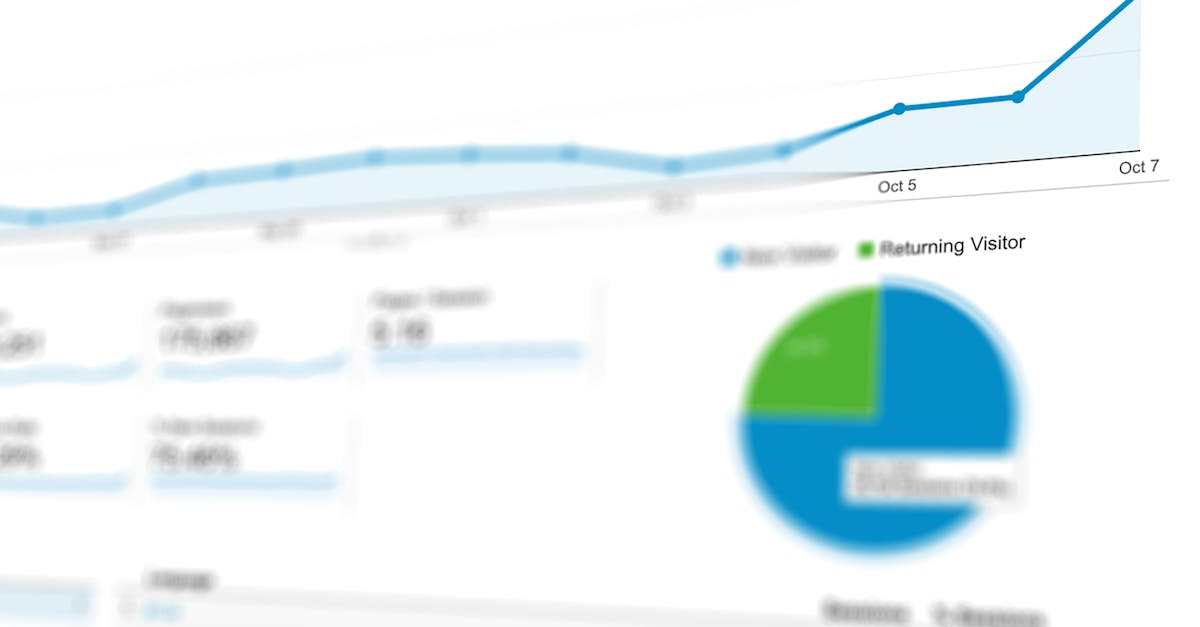
Bad visuals distort facts. Learning to read charts critically prevents being misled by color, scale, or aggregation choices.
Check axis scales: a truncated y-axis can exaggerate small changes.
Note aggregation: weekly averages can hide weekday patterns.
Beware stacked charts: relative area can mislead about absolute contributions.
Prefer small multiples to overlaid lines when comparing categories.
"A misleading scale can make a 2% change look like a crisis; always look at the axis range and units before reacting."
Simplify complex visuals by recreating them with fewer series or by plotting raw counts instead of percentages. This often reveals the true story.
Even without advanced math, you can avoid frequent statistical mistakes by applying short rules of thumb.
Small sample caution: If n < 30, treat percentage swings as noisy unless supported by context.
Regression to the mean: Extreme values often move closer to average on repeat measurement.
Multiple comparisons: Testing many hypotheses increases false positives; adjust expectations.
Outliers: Identify and decide whether outliers are data errors, special cases, or meaningful signals.
When in doubt, calculate simple confidence intervals or present both median and mean to show distribution characteristics.
Having a small toolkit speeds exploration. Here are efficient tools and sample commands to get started.
Use spreadsheet filters and pivot tables for fast summaries.
Run quick aggregations in SQL for larger datasets.
Use Python with pandas for reproducible checks and plots.
Example Python snippet to inspect a CSV distribution:
import pandas as pd
df = pd.read_csv('data.csv')
print(df.describe())
df['value'].hist()
This minimal code shows central tendency and distribution quickly. For documentation and deeper functions, consult the pandas documentation.
Dashboards are useful for monitoring trends, but they can hide nuance. Use dashboards for signals, not final answers.
Trust a dashboard when metrics have clear definitions and automated tests.
Dig deeper when metrics change dramatically or when business context shifts.
Validate important decisions with raw extracts, not just dashboard snapshots.
Good dashboards include tooltips, data lineage, and links to source queries. If those are missing, treat the numbers as preliminary.
Data interpretation fails if the audience leaves with the wrong impression. Structure communication to make the signal obvious and the uncertainty visible.
Start with the headline: one clear sentence summarizing the insight.
Show the evidence: include the key chart or table that supports the headline.
Explain limitations: list assumptions and possible alternate explanations.
Use one-number headlines that link to the visualization. When possible, provide next steps or actions tied to the finding.
How do I know if a trend is real?
Look for consistency across time, segments, and measurement methods. Reproduced effects across independent sources are more credible.
When should I use median instead of mean?
Use median when the distribution is skewed or when outliers distort the average.
Are visualizations enough for decisions?
Visuals are a starting point. Verify with raw data checks, segmentation, and sensitivity tests before acting on high-stakes choices.
To deepen data literacy, consult resources that focus on definitions, measurement, and reproducible analysis. For example, research on public opinion and data interpretation is available from Pew Research Center, which provides transparent methodology for surveys and reports.
Health and science communications illustrate how data framing matters; explore methodological notes at Harvard Medical School for examples of how measurement choices shape conclusions.
"Data without context is just noise; context transforms numbers into meaning."
Data becomes understandable when you adopt a consistent approach: clarify definitions, check scales, visualize distributions, and validate signals across segments. Those habits convert confusing figures into reliable insights.
Start each analysis with a precise question.
Inspect definitions and units first.
Visualize distributions and segment your data.
Communicate a clear headline and highlight uncertainty.
Now that you understand these strategies, you are ready to apply them to your next dataset. Start this week by picking one recurring dashboard and running the short checklist above: verify definitions, replot the primary metric, and segment the results. Take that first step to make data a tool for clarity instead of a source of confusion.